OVERVIEW
Create a virtual concierge that will surprise, delight, educate and engage our customers by telling a modern brand story, providing personalized discovery and delivering high-touch service.
CONCEPT
Empower every woman to be beautiful by delivering an experience that conveys the modern values of Estée Lauder from counter to online.
1. Appeal to a next generation of customers
2. Deliver a personalized experience through superior service
3. Create an intelligent site that evolves with the user
4. Drive conversion and immerse users in modern, Estée Lauder
5. Encourage sharing and social across all the user journey
RESULTS
+34% Mobile traffic increase over prior year
+.5-1% Average conversion rate increase
+67% Increased Virtual Beauty Advisor engagement
+.5-1% Average conversion rate increase
+67% Increased Virtual Beauty Advisor engagement
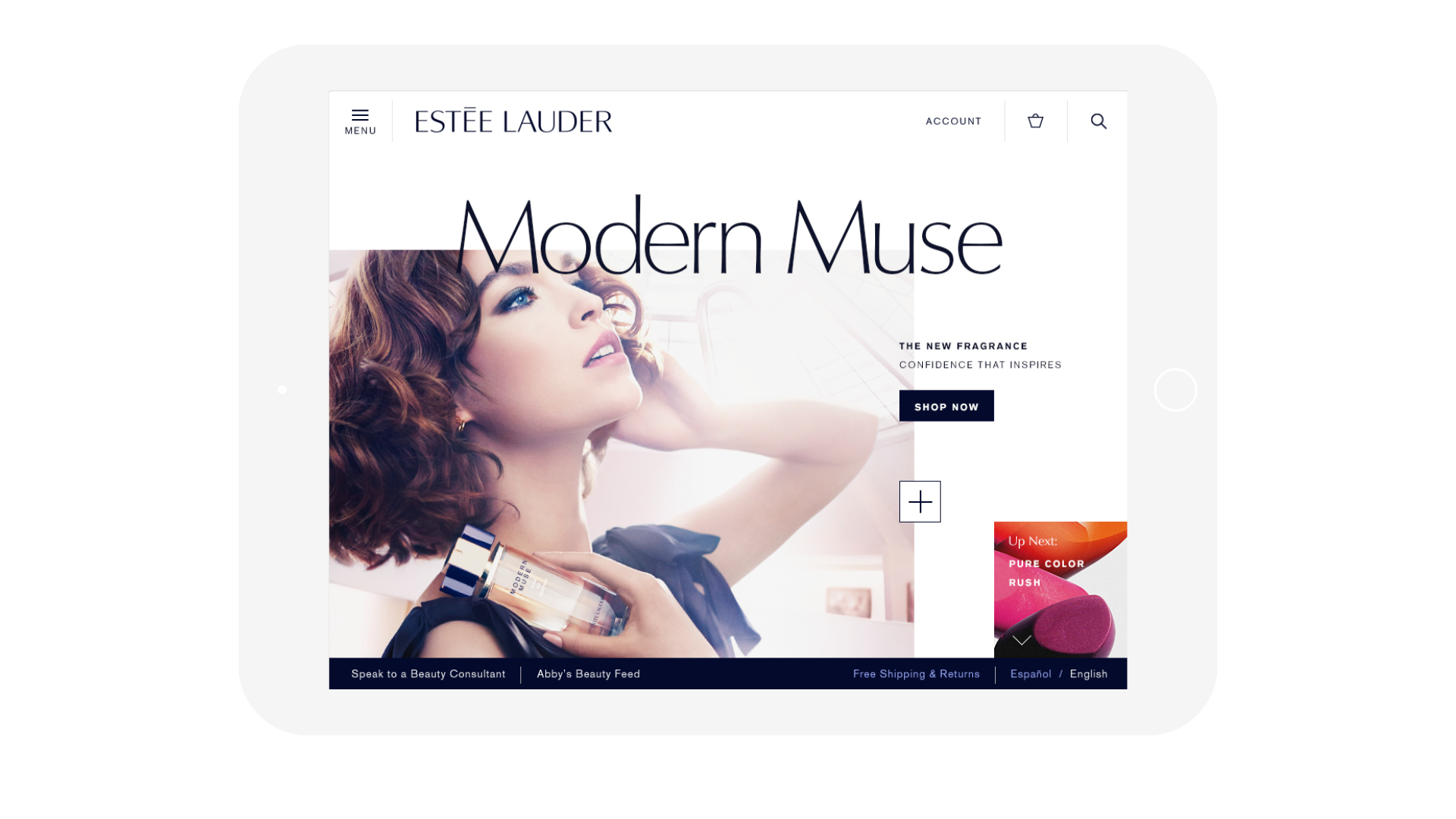
"This is much more than a new site, it's a digital flagship that leverages luxury, creativity and technology to communicate with women and inspire them to connect with their own beauty and Estée Lauder in a whole new way"
- Jane Hertzmark Hudis, Global Brand President, Estée Lauder
DESIGN SYSTEM
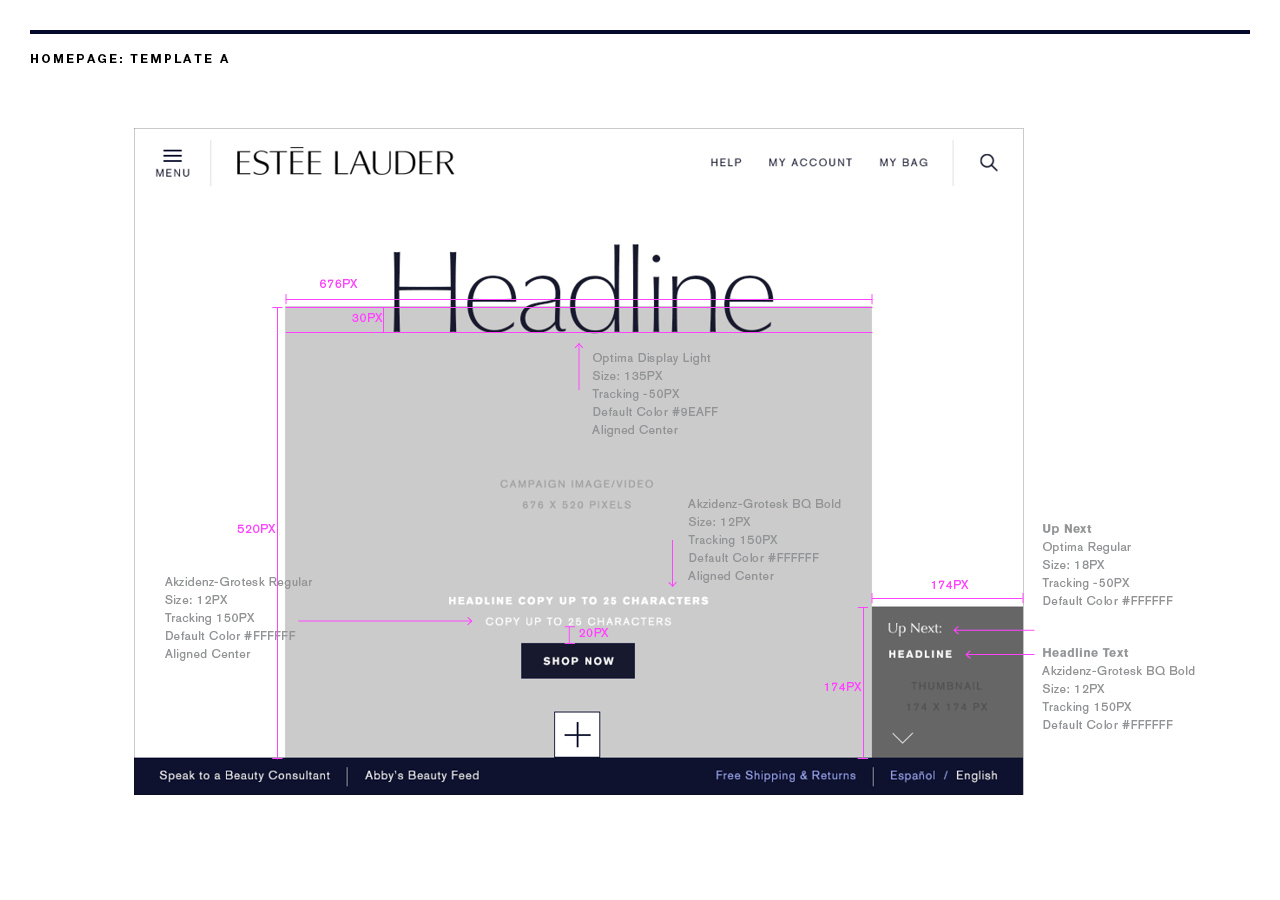
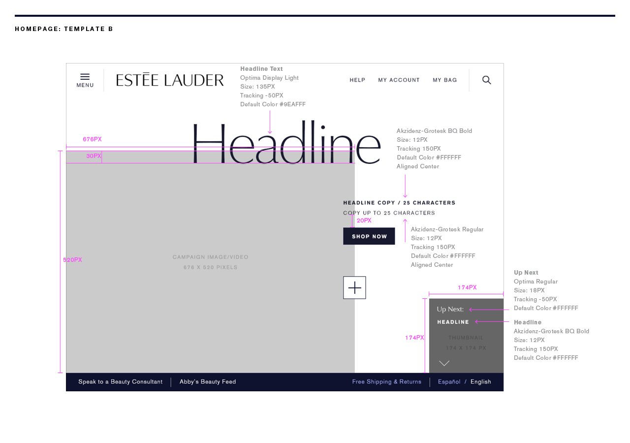
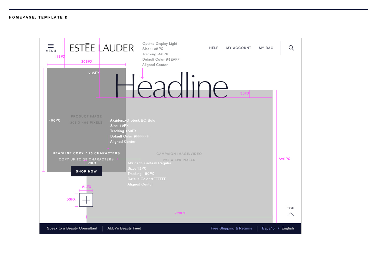
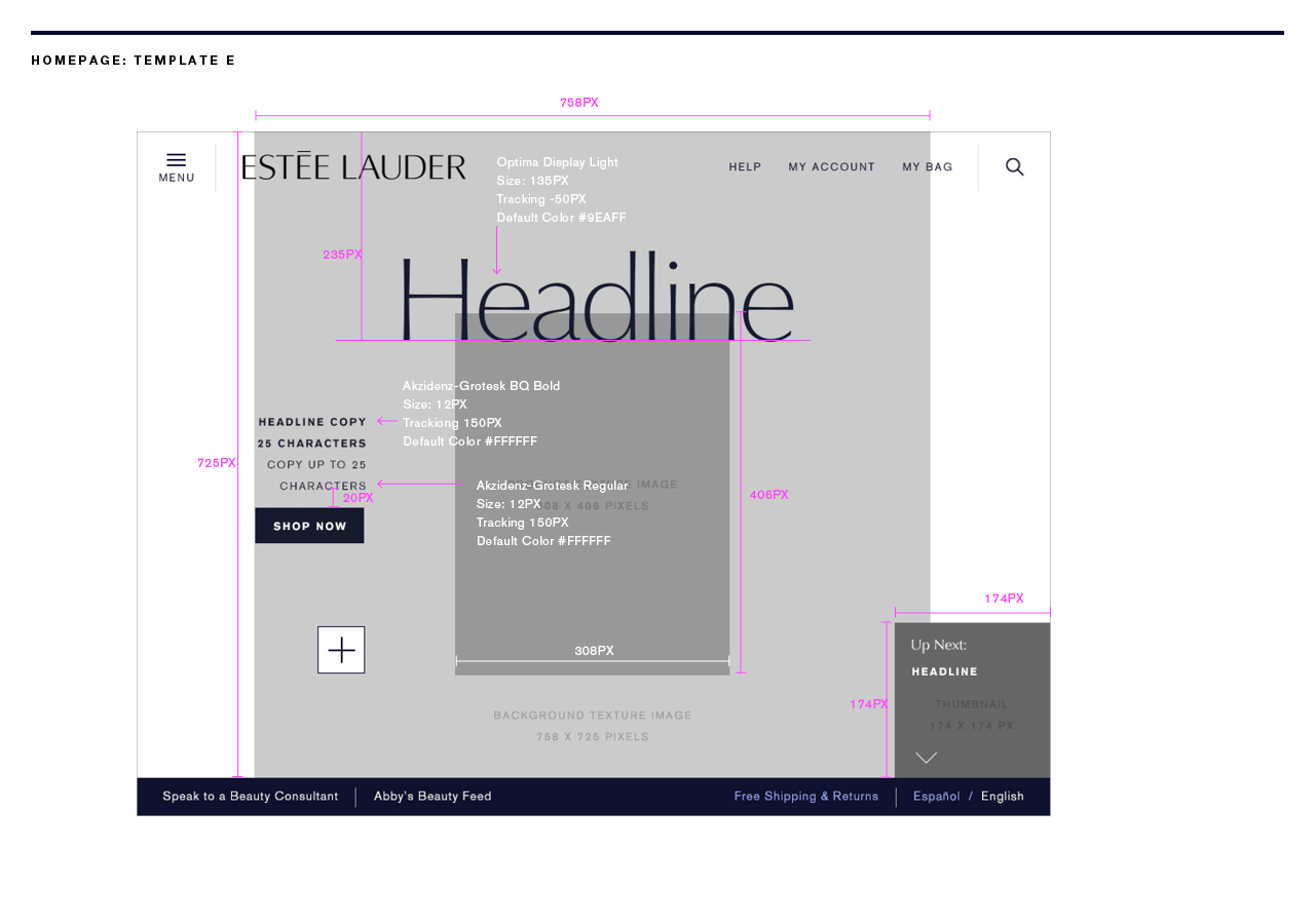
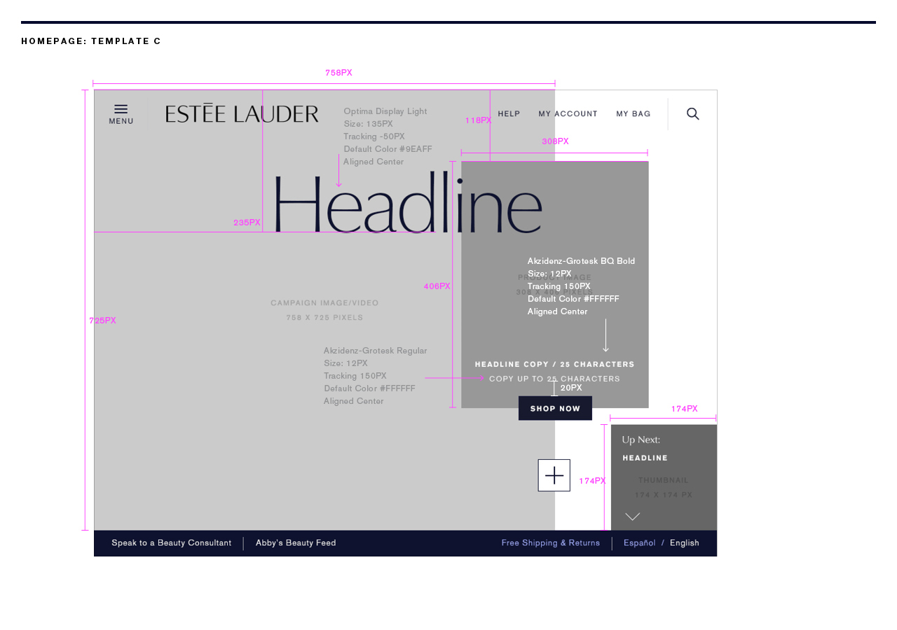
I created a library of unique layouts that were built into the proprietary Estée Lauder Drupal platform and are still used today. Each component is usable as an interactive element on common pages throughout the design system.
TABLET FIRST
I approached the design with tablet as the primary breakpoint. This was revolutionary for Estée Lauder but also where their traffic was greatest. The goal was to edit down taxonomy in order to reduce decision making, and look sophisticated. Once the navigation opens, a robust array of subcategories are presented alongside tutorials, content and tools relevant to the customer.

EXPERIENCE
My vision for the site was that each page acted as a landing page. Customers were entering from search, social, email, or various marketing and completely bypassing the homepage. My goal was to enable the customer to make informed product purchases anywhere she is on the site without having to drill down the conversion funnel by clicking pages.
CONVERSION
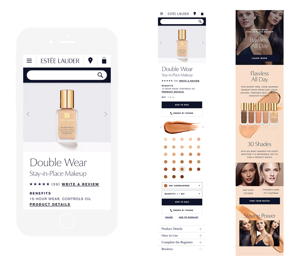
Overlays are cumbersome on mobile devices. In order to allow for efficient quickshop on any device, I designed a new solution that expanded a panel revealing key product details. The customer can now compare any products by expanding the color icon at a glance.
SERVICE CENTERED SHOPPING
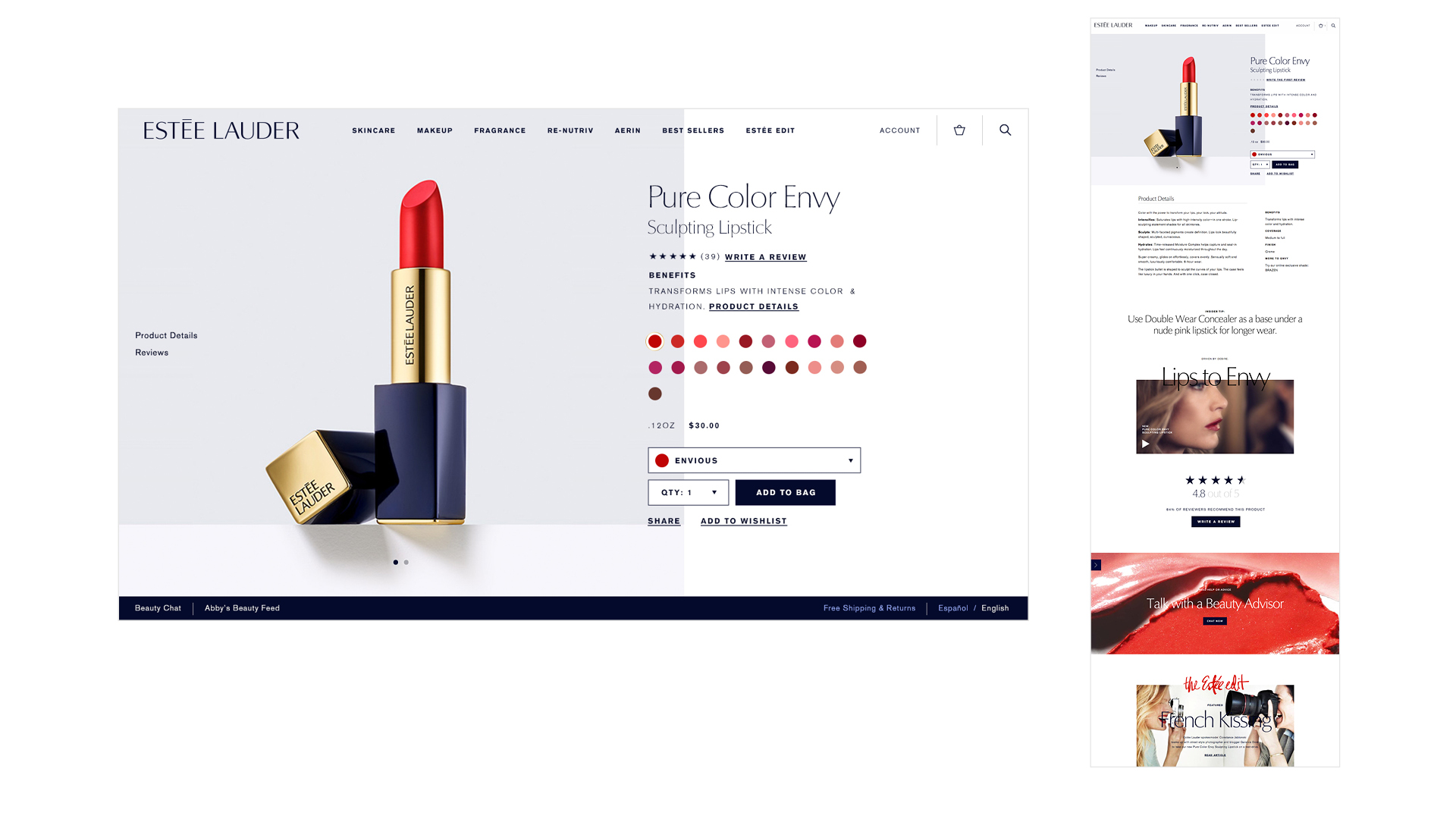
The Product Page is an innovative design that was one of the first to market to have a sticky shopping component follow the user down the page. Anchor links on the left cleaned up the page to make the product heroic and key information stand out. My Art Director and I created the art direction for all product photography throughout the site, which is still in use today.
The shopping experience includes user-friendly shopping pages, easy access to insider beauty tips, shopping directly from user generated content feeds, The Estée Edit, online beauty consultations and co-shop visits. In addition, a new mobile platform streamlines the purchase experience for women on the go, and offers call-to-order functionality. Contributing to the omnichannel experience, a woman can view her beauty profile on the mobile site while in store – accessing ratings and reviews, product recommendations, previous purchases and her wish list – so she is browsing and learning while in store.

PERSONAL EXPERIENCE
A "Beauty Feed" that functions as each woman's personalized beauty hub, delivering highly tailored product and content recommendations as well as exclusive offers based on her interests. The more a woman visits the site and engages with her “Beauty Feed”, the more esteelauder.com will intuitively understand her beauty preferences and be able to create a more personalized experience for her, including her favorite products, her beauty consultation history, site editorial and social media content that interests her.

NO MORE MICRO-SITES
Micro-sites for campaign and product launches were time consuming to create, and often lived outside the conversion funnel at a dead end. I designed a unique system to eliminate the need for separate micro-sites that was easy to create, and kept the customer within the shopping experience. The “Boutiques,” were in-line experiences that could insert anywhere on a page. When engaged, they split open the page and expanded. They allowed for rich content to co-exist on the page along with shopping and reduce overall bounce rates.
DIAGNOSTIC TOOLS
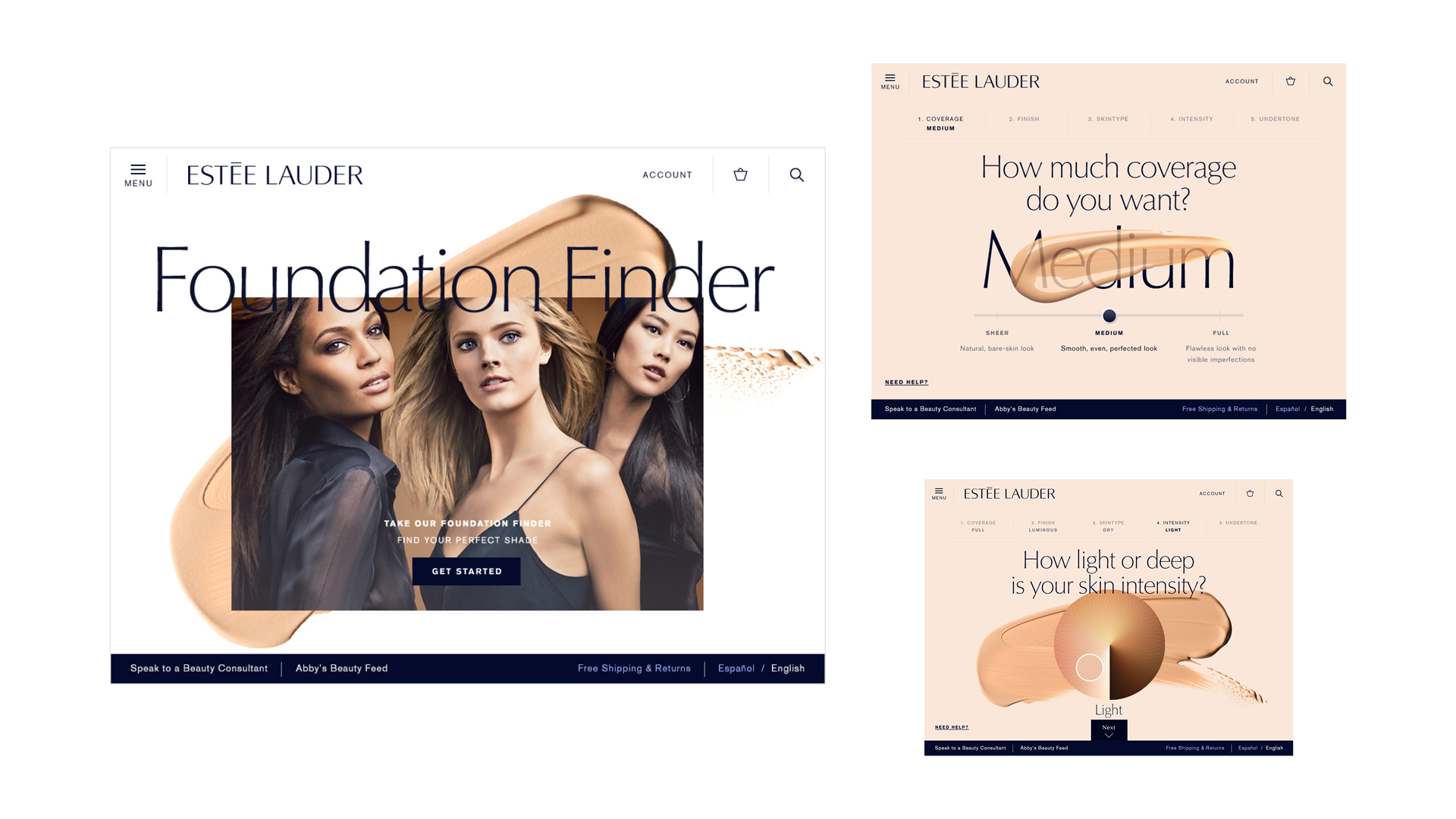
Interactive tools throughout the site identify a woman's beauty needs and facilitate product recommendations. The Foundation Finder, an app-like experience, asks questions about the level of foundation coverage required, from "sheer" to "full", and makes appropriate recommendations. Product Comparison tools and filters make finding the right products easier, and Regimen Suggestions with “how to use” instructions help women create a customized beauty regimen.

CONTENT AND COMMERCE
The Estée Edit is original editorial content that is shoppable and seamlessly woven throughout esteelauder.com. It combines inspirational stories about Estée Lauder's unique brand heritage with articles focused on the brand’s modern vision of beauty and related lifestyle topics. The Estée Edit includes exclusive content from the brand's rich archives, profiles on inspirational women such as Iman and Aerin Lauder, and articles featuring social media influencers such as blogger/photographer Garance Dore, vlogger Chriselle Lim, chef Camille Becerra and Estée Lauder’s spokesmodels. Content from The Estée Edit is shareable across social media, including inspirational quotes from founder, Estée Lauder.
AWARDS AND TEAM
2015 Pixel Awards People’s Choice (Fashion)
2015 Clio Awards (Finalist)
2015 Clio Awards (Finalist)
CREATIVE TEAM
Ian Schatzberg, Rekishia Jessup, Cherlyn Russo, Jorge Balarezo, Karen Kranack
Ian Schatzberg, Rekishia Jessup, Cherlyn Russo, Jorge Balarezo, Karen Kranack